
As developers, we are used to creating reusable UI components to use across different views of our applications. This behavior is pretty common since we do that with code in general. It is a fundamental principle of writing efficient code. We are constantly creating reusable code, or even extracting existing code to reuse it in other places.
So, what’s the big deal about creating those UI components? Well, the answer lies in How we build this components. What does that mean? I saw a lot of SwiftUI projects in these past five years. 80% of those projects that has they own custom components had the same pattern. Their components don’t feel like the native ones. And I’m not talking about the appearance, but the way we instantiate and modify them.
Many custom components lack the fluid, intuitive experience that SwiftUI’s native components offer. This article is all about bridging that gap making our custom components as seamless to use as the built-in ones.
Common Approaches and their problems
There are some approaches that are pretty common when we talk about creating UI components with SwiftUI. I will describe some of them using a tag component as an example.

Not-Custom Component
This approach doesn’t allow us to modify the appearance of the component because all of its properties are defined within the component itself. Most of the time, these properties are hardcoded rather than stored in variables. That makes impossible to adjust their values from outside the component. Let’s check how it looks the code of this tag, and how we create an instance of it.
struct Tag: View {

    @Binding var isSelected: Bool
    var title: String

    var body: some View {
        HStack {
            Image(systemName: "star.fill")

            Text(title)

            if isSelected {
                Image(systemName: "checkmark")
            }
        }
        .padding(10)
        .background(isSelected ? Color.blue.opacity(0.4) : Color.gray.opacity(0.4))
        .clipShape(RoundedRectangle(cornerRadius: 10, style: .continuous))
        .onTapGesture {
            withAnimation {
                isSelected.toggle()
            }
        }
    }

}

// Creating a new tag
Tag(isSelected: .constant(true), title: "Tag")
That doesn’t look that bad actually, right? For some scenarios it will be enough. But this lack of customizable properties bothers me. If one day we need to change a component to make it customizable, it can give us a great headache. Not this one, this one is simple. But there are complex components that should be designed to be scalable.
The Constructor is Responsible for the Appearance
In this second approach the lack of customizable attributes is solved. The component will have a variable for each attribute that it contains. The problem is all the properties will be set on the constructor. Take a look on this:
struct Tag: View {

    @Binding var isSelected: Bool
    var title: String
    var icon: String
    var selectedBackgroundColor: Color
    var commonBackgroundColor: Color
    var cornerRadius: CGFloat
    var selectionIndicator: String
    var padding: CGFloat

    var body: some View {
        HStack {
            Image(systemName: icon)

            Text(title)

            if isSelected {
                Image(systemName: selectionIndicator)
            }
        }
        .padding(padding)
        .background(isSelected ? selectedBackgroundColor : commonBackgroundColor)
        .clipShape(RoundedRectangle(cornerRadius: cornerRadius, style: .continuous))
        .onTapGesture {
            withAnimation {
                isSelected.toggle()
            }
        }
    }

}

// Creating a new tag
Tag(
    isSelected: .constant(true),
    title: "Tag",
    icon: "star.fill",
    selectedBackgroundColor: Color.blue.opacity(0.4),
    commonBackgroundColor: Color.gray.opacity(0.4),
    cornerRadius: 10,
    selectionIndicator: "checkmark",
    padding: 10
)
With this approach everything is custom, but the tag constructor is huge and there is no default values to help.
Custom With Default Values
This last approach is actually pretty acceptable. It merges the customizable properties of the second approach with some default values. That helps us to only set the values we wanna change, and not all of them. That’s how it looks
struct Tag: View {

    @Binding var isSelected: Bool
    var title: String
    var icon: String = "star.fill"
    var selectedBackgroundColor: Color = Color.blue.opacity(0.4)
    var commonBackgroundColor: Color = Color.gray.opacity(0.4)
    var cornerRadius: CGFloat = 10
    var selectionIndicator: String = "checkmark"
    var padding: CGFloat = 10

    // Implementation of the component ...

}

// Creating a new tag
Tag(
    isSelected: .constant(true),
    title: "Tag"
)
See? It looks a lot better, doesn’t it? As I said, this approach is acceptable, but that doesn’t feel like a native component. But how can we make it behave like a native view component? In order to do that first we need to figure out how native components behave.
How Native View Components Behave
When calling UI components, like Text for example, SwiftUI will allow us to call a bunch of methods to modify the appearance of the component. You certainly already notice that those methods are called in a chain:
HStack {
    // Implementation of the component ...
}
.padding(padding)
.background(isSelected ? selectedBackgroundColor : commonBackgroundColor)
.clipShape(RoundedRectangle(cornerRadius: cornerRadius, style: .continuous))
.onTapGesture {
    withAnimation {
        isSelected.toggle()
    }
}
See? We are adding a padding, then a background, clipShape, etc. How is that possible? That’s simple, all those methods are returning the view itself after applying the change. You can check that if you hold the option button and click in the method name.
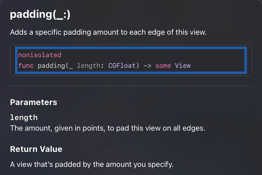
As you can see, the padding receives a CGFloat and it returns a padded view. The same goes for methods like background(), overlay(), etc. But how do we make this magic happen to our components?
The Fluent Interface Design Pattern
If you read my article Updating your SQLite table structures with Swift you are familiar with the builder design pattern. If you are not, I suggest you to take a look on that because we will do something similar here.
But instead of using the builder pattern we will use the fluent interface pattern. Why not using builder pattern to create the components? Because the result would be different. Using builder we would have to implement builder classes that will return the object in the end. What we want here is, every time we change the object, it will return itself. Another behavior that we don’t want is to call build() to get the object. It should behave exactly like what we saw above, modifying the HStack.
The Fluent Interface design pattern aligns perfectly with the declarative nature of SwiftUI. In a declarative UI framework, we focus on describing what the UI should look like rather than detailing every step of how to build it. Fluent interfaces enhance this experience by allowing developers to configure components in a way that feels natural and expressive, through method chaining.
In SwiftUI, every time you call a modifier on a view, you’re effectively creating a new instance of that view with the modification applied. This chaining mechanism makes your code readable, like a list of instructions describing the final appearance. The fluent approach eliminates the need for cumbersome initializers or rigid property configurations. It gives to the developers the power to make changes step by step, much like a story unfolding in code.
This readability and expressiveness make fluent interfaces especially well-suited to declarative UI frameworks like SwiftUI. They help to create composable components. You can modify one piece without impacting others. It makes the component scalable, which grow naturally as we add more methods or modifiers without sacrificing clarity.
Using this pattern, our custom components can take on the same elegance as native components. It makes them feel like a natural extension of SwiftUI’s ecosystem. Instead of asking developers to configure everything upfront or work around hardcoded values, fluent interfaces invite developers to interact with components, shaping them line by line in a clean, predictable manner.
Implementing Fluent Interface to our Tag
First thing we will do is turning all the variables private. The only possible way to change them will be calling the methods that we will create to handle the modifications.
struct Tag: View {

    @Binding var isSelected: Bool
    var title: String
    private var icon: String = "star.fill"
    private var selectedBackgroundColor: Color = Color.blue.opacity(0.4)
    private var commonBackgroundColor: Color = Color.gray.opacity(0.4)
    private var cornerRadius: CGFloat = 10
    private var selectionIndicator: String = "checkmark"
    private var padding: CGFloat = 10

    // implementation goes here ...

}
If you’re wondering why isSelected and title aren’t private, that’s because I wanna pass them only in the constructor.
Once you do these changes, the compiler will complain about the initializer be inaccessible. To solve this, let’s create a public initializer.
public init(isSelected: Binding<Bool>, title: String) {
    self._isSelected = isSelected
    self.title = title
}
Now let’s implement some methods to modify those variables. In order to do that, I will create an extension for my Tag, and there will create the methods. When creating this methods, we should keep in mind the expected result. In other words, the methods should receive some attribute and return the Tag itself.
extension Tag {

    func `backgroundColor`(_ color: Color) -> Self {
        var copy = self
        copy.commonBackgroundColor = color
        return copy
    }

    func `selectedBackgroundColor`(_ color: Color) -> Self {
        var copy = self
        copy.selectedBackgroundColor = color
        return copy
    }

    func `icon`(_ icon: String) -> Self {
        var copy = self
        copy.icon = icon
        return copy
    }

    func `internalPadding`(_ padding: CGFloat) -> Self {
        var copy = self
        copy.padding = padding
        return copy
    }

    func `cornerRadius`(_ radius: CGFloat) -> Self {
        var copy = self
        copy.cornerRadius = radius
        return copy
    }

    func `selectionIndicator`(_ selectionIndicator: String) -> Self {
        var copy = self
        copy.selectionIndicator = selectionIndicator
        return copy
    }

}
The implementation of the methods is pretty simple. We store a copy of the object in a variable, change the desired attribute in this copy, and return the copied object.
And now, my friend, the magic will happen. By using a fluent interface, we achieve a clean, declarative style, making our component’s customization feel just as natural as native SwiftUI views. Let’s create a new tag and check that out.
Tag(isSelected: .constant(true), title: "Tag")
    .backgroundColor(.purple.opacity(0.4))
    .selectedBackgroundColor(.red.opacity(0.4))
    .icon("heart.fill")
    .selectionIndicator("xmark")
    .cornerRadius(28)
    .internalPadding(16)
Look at that beautiful piece of code. It looks a lot like a native component, doesn’t it? That improves the readability of our code. It allows us to modify the component, step by step, without using the constructor. Other good thing about it is that, since our component is a view, it still has access to all those native modifier methods that SwiftUI provides. Give it a try:
Tag(isSelected: .constant(true), title: "Tag")
    .cornerRadius(28)
    .internalPadding(16)
    .overlay {
        Circle()
    }
Pretty cool, huh? So, I will discard the overlay an show you how our component looks like after implementing this pattern.

Before finishing this article, I need to say that this approach also works with callbacks, for handling events, for example. let’s add another attribute to our Tag object: private var onIndicatorTapped: (() -> Void)?. This callback will be called every time user taps the indicator image.
Image(systemName: selectionIndicator)
    .onTapGesture {
        onIndicatorTapped?()
    }
And in the extension, let’s create the method that modify the callback.
func `onIndicatorTapped`(perform action: @escaping () -> Void) -> Self {
    var copy = self
    copy.onIndicatorTapped = action
    return copy
}
To use that, is the same way we use onTapGesture:
Tag(isSelected: .constant(true), title: "Tag")
    .backgroundColor(.purple.opacity(0.4))
    .selectedBackgroundColor(.red.opacity(0.4))
    .icon("heart.fill")
    .selectionIndicator("xmark")
    .cornerRadius(28)
    .internalPadding(16)
    .onIndicatorTapped {
       print("indicator tapped")
    }
There you have it, just as any other gesture. Now, every time the user taps the indicator it will print a message in the console.
Conclusion
Embracing the Fluent Interface pattern will make our custom components feel as native and intuitive as the built-in ones. The key is to make the experience of building and customizing components fluid and natural.
This shift in approach is not just about code aesthetics; it’s about making development more efficient and enjoyable. It reduces complexity, and provides a consistent, declarative way to interact with UI elements.
So, go ahead. Take your components to the next level. Make them expressive, and let them tell their story line by line, just like the native views do.
 Coding With Renan
Leave a comment